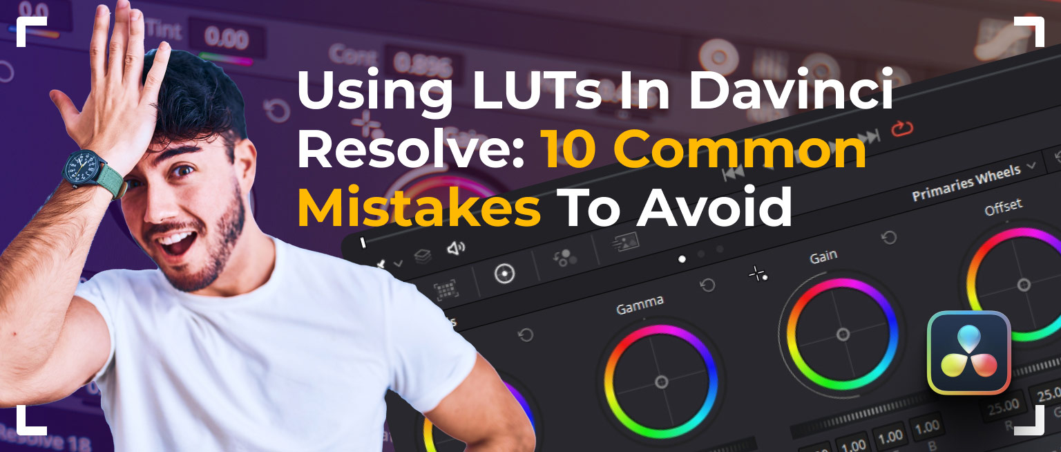
Ten reasons why turn up here, each with a way out, all framed around DaVinci Resolve. The culprits include matching a LUT to the wrong profile, grading blind without scopes, leaning on the LUT instead of per-clip work, fighting it under colorful dance-floor lights, and stacking nodes in the wrong order. Before-and-after frames make every fix obvious. Aimed at editors whose grades come out uneven.
Do you employ LUTs in DaVinci but occasionally fail to achieve the desired result? Today, we’ll explore common mistakes videographers make with LUTs and show you how to avoid them, so you can create stunning visuals every time. Get ready to take your color grading skills to the next level!
Top 10 Mistakes when applying LUTs in video editing
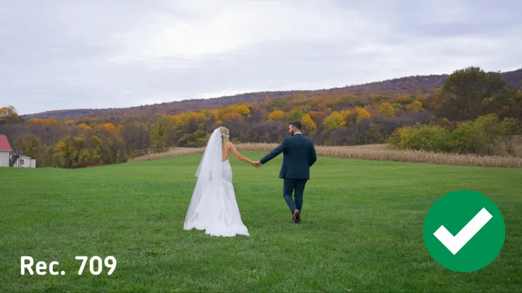
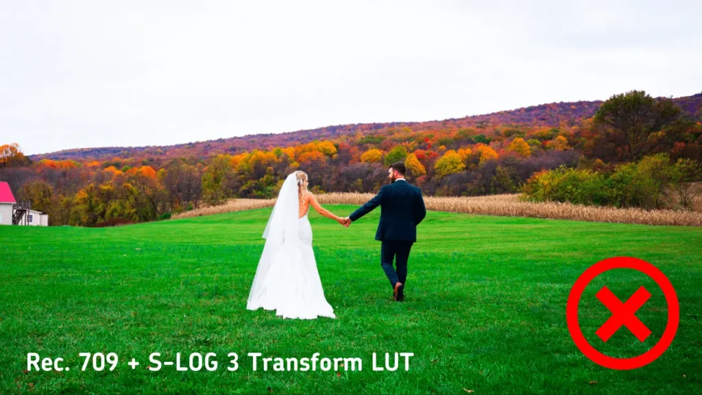
- Incorrect LUT choice
One of the most common errors is using a LUT that isn’t meant for your original footage. For instance, applying a LUT designed for S-Log3 to material shot in Rec.709 can distort colors.
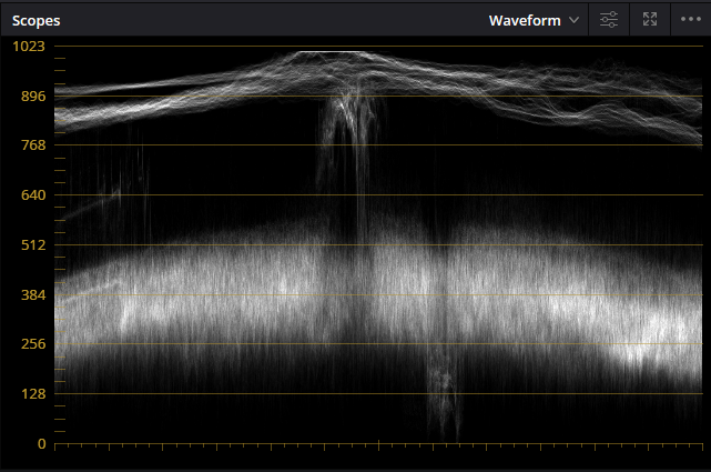
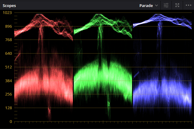
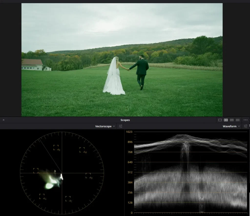
- Working with LUTs without using Scopes
Scopes are visualization tools that assist video engineers and colorists analyze color and brightness information within video footage. They offer essential data that cannot be solely assessed visually and are utilized to achieve technically precise and visually coherent color correction.
The main types of Scopes in DaVinci Resolve:
- Waveform – shows the image brightness along the horizontal axis of the video.
- RGB Parade shows the levels of red, green, and blue colors individually, enabling you to spot color imbalance and make adjustments accordingly.
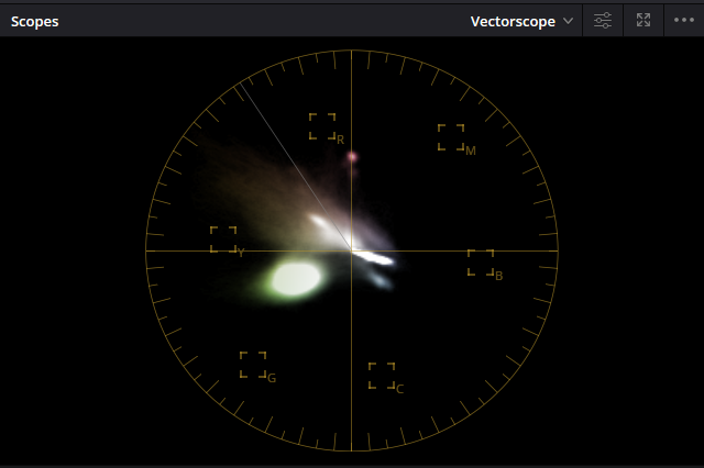
- Vectorscope – this tool depicts the saturation and hue of colors in the video. It illustrates color distribution in a circular manner, where the angle denotes the hue, and the distance from the center represents the saturation.
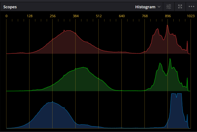
- Histogram – shows the distribution of brightness or color components throughout the entire image. This allows you to see how well the image is exposed and where potential loss of details may occur in the shadows or highlights.
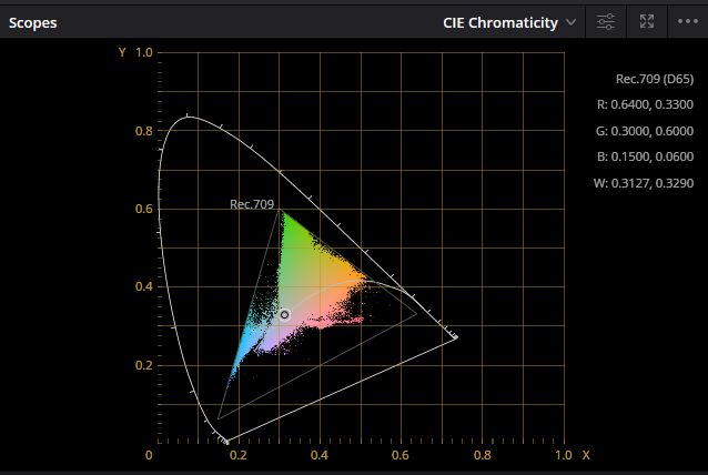
- CIE Chromaticity Diagram, or CIE color chart, is a visual representation of colors that the human eye can perceive. It’s grounded in color vision theory and was devised by the International Commission on Illumination (CIE) in 1931. This diagram showcases the color gamut that can be replicated in a two-dimensional space, with the axes representing chromaticity coordinates x and y.In the realm of color correction within DaVinci Resolve and other color grading systems, the CIE Chromaticity Diagram serves as a tool for scrutinizing the color space and hues within an image. This aids in understanding how different colors are spread across the visible spectrum and how they’ll appear on various output devices. Additionally, the CIE diagram denotes specific zones representing standard color spaces like sRGB, Adobe RGB, DCI-P3, and Rec. 2020. This allows colorists to ensure their work meets the necessary standards.
By employing these tools, a colorist can meticulously fine-tune color balances, contrast, saturation, and other image parameters, ensuring there are no overexposed or excessively dark areas. Moreover, they verify that color rendition complies with technical standards and the creative intent of the project. Scopes are invaluable when handling log material, necessitating precise color correction to restore colors and contrast to standard levels.
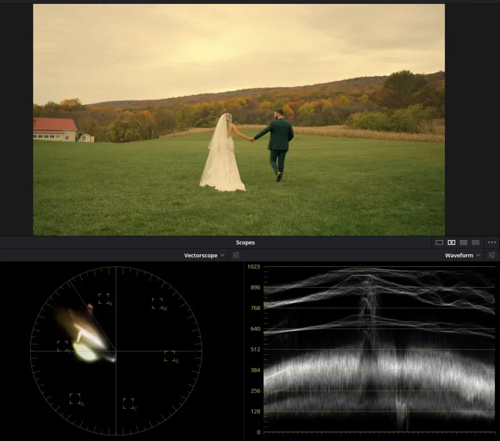
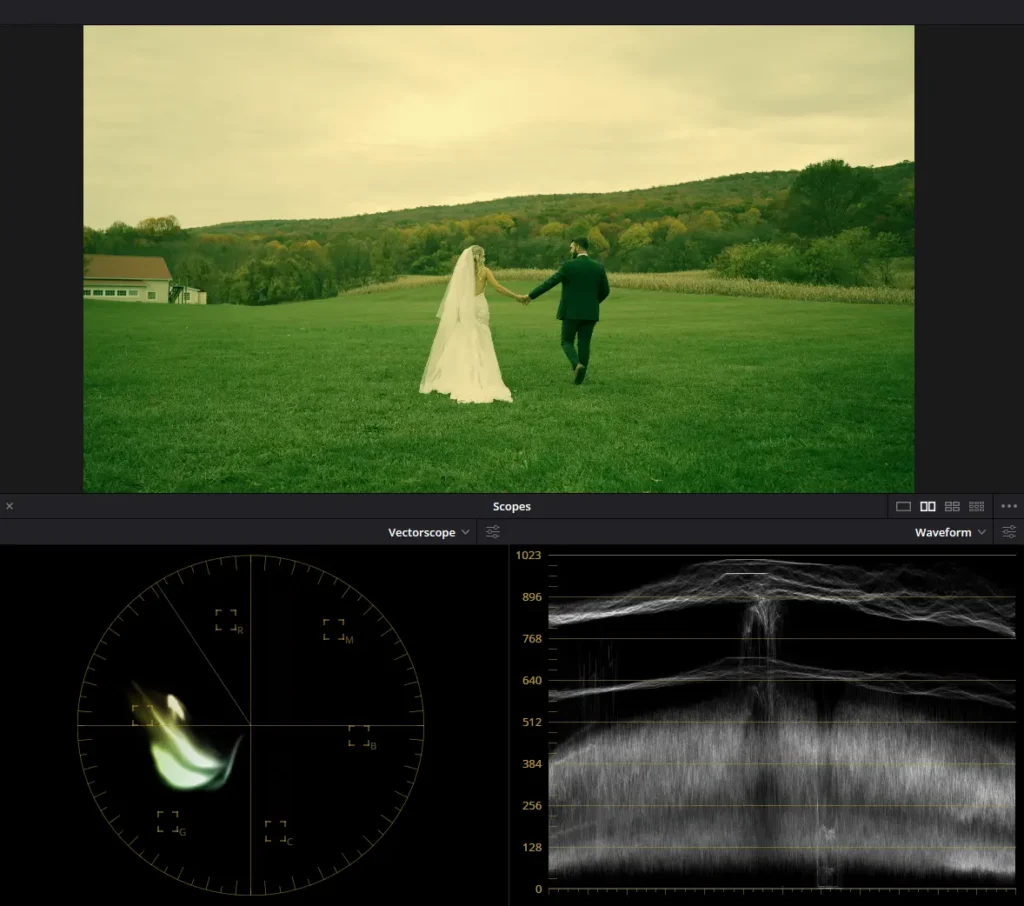
- Excessive reliance on LUTs
Some editors depend solely on LUTs for color correction, neglecting the need for additional adjustments and tweaks for each unique clip. For example, adding vignettes, locally adjusting the color of elements within the shot, and fine-tuning local exposure in different parts of the shot. These three actions were demonstrated in the example below. In the second clip, you can observe the addition of a vignette, warmer tones and increased brightness with saturation applied to the clouds, and adjustments made to the brightness and saturation for the foreground forest.
- Using LUTs for scenes with vibrant lighting fixtures
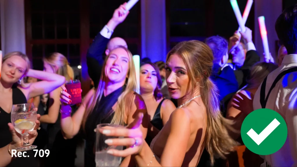
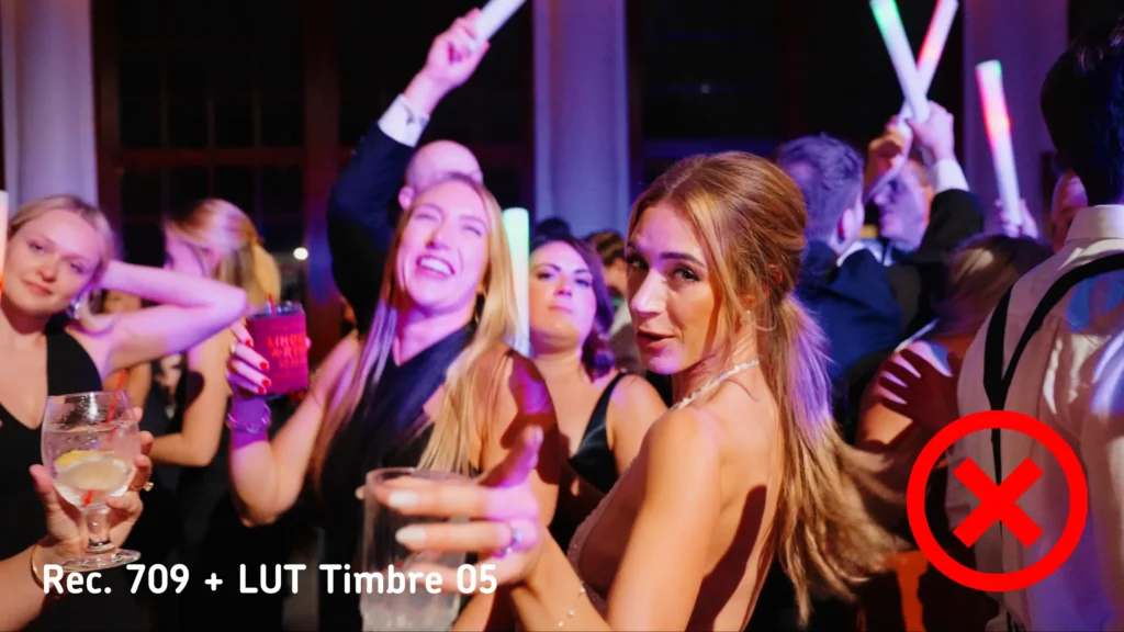
When we’re shooting evening wedding scenes with lighting fixtures, it’s not always effective to apply the same LUT across all the footage. For example, in a dance floor setting with numerous colorful elements like lighting fixtures, the impact of the LUT might either go unnoticed by viewers or affect the saturation of the lighting fixtures and overall color composition. To maintain picture quality, it’s advisable to opt for a different LUT that doesn’t alter color saturation or to forego using one altogether. Below, you’ll find an example showing color grading with and without the Timbre 05 LUT. You’ll notice that while the Timbre 05 LUT adds a touch of contrast to the shot, it also enhances the saturation of skin tones and eliminates the blue tint from the lighting fixtures on the dance floor. Adjusting skin tone saturation and contrast manually can be done without relying on the Timbre 05 LUT.
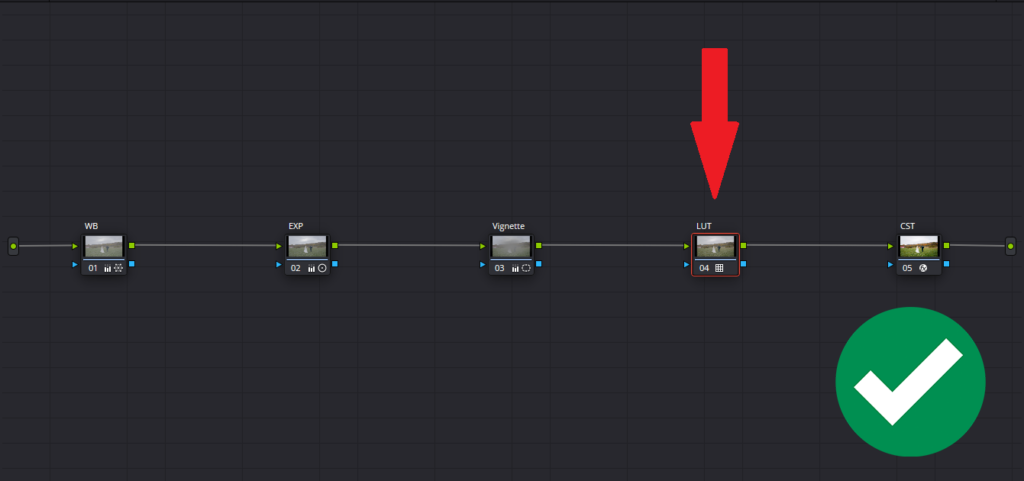
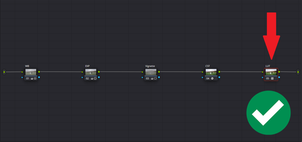
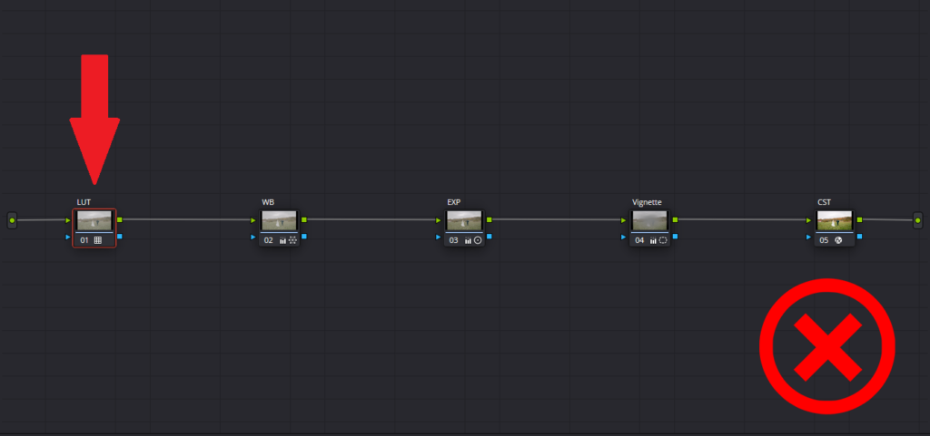
- Incorrect node sequence
In DaVinci Resolve, the order of nodes in the processing chain matters. Applying a LUT before adjusting exposure or white balance can cause distortions. Typically, LUT application occurs at the end of the processing chain, following the Color Space Transform to Rec.709, or occasionally before it, as specified in the usage instructions.
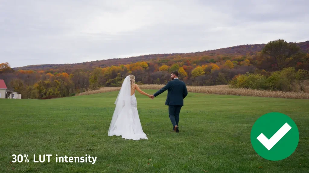
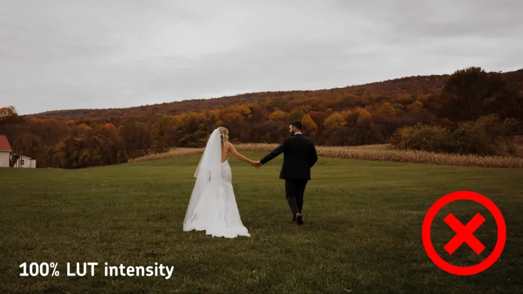
- Overuse of LUTs
Some LUTs create a highly stylized effect. While this may seem attractive initially, excessive application can make the image appear unnatural and lose details in the shadows or highlights. In such cases, you can either substitute the LUT or adjust the intensity of the current one. In the example below, at 100% intensity, the LUT yields an excessively dark image, causing details in the groom’s jacket to vanish. To address this, the LUT intensity was reduced to 30% from 100%.
- Improper LUT combination
Using two or more LUTs with different Looks leads to a negative color representation in the clip. For instance, applying a Monochrome look to the shot and then adding an Analog look with a different color would yield less than optimal results.
- Failing to check LUTs on different devices
Colors and contrast may differ across various screens. Before making a final decision, test how the LUT appears on different devices to ensure the best outcome.
- Ignoring input and output parameters of LUTs
Some LUTs are crafted with specific input and output specifications. Neglecting these parameters and applying LUTs to unsuitable material can result in unexpected outcomes. It’s crucial to thoroughly review (or watch) the instructions for applying LUTs, which outline their usage specifics.
- Ignoring Screen Specifics
When working on a screen that’s uncalibrated or has skewed color reproduction, editors might make incorrect color correction decisions based on its appearance. Before buying a monitor or laptop for a filmmaker or editor, it’s crucial to consider the display specifications and its intended use. Gaming laptops and monitors typically don’t meet color correction standards as they lack 100% sRGB, Adobe RGB, DCI-P3, and may exhibit color display flaws. Monitors certified for color correction typically bear CalMAN certification (developed by Portrait Displays Inc.) or certification from other entities like Pantone (BenQ), EBU (European Broadcasting Union), SMPTE (Society of Motion Picture and Television Engineers). Examples include monitors like Asus ProArt, BenQ, etc., which come with factory calibration.
Calibration is the process of adjusting monitor settings to meet color reproduction standards, while profiling involves creating a color profile that fine-tunes the colors output by the operating system to match the monitor’s characteristics.
When discussing monitor calibration, it’s recommended to do it every 6 months or more frequently, depending on the manufacturer’s instructions and factors like how often the monitor is used and environmental conditions such as lighting. Special devices are used for this purpose. They allow you to calibrate the monitor yourself (such as Datacolor or X-Rite calibrators, among others), or you can seek assistance from a specialized center where professionals can help you calibrate. These centers have expensive specialized equipment with reference monitors.
Conclusion
Mastering the art of using LUTs in DaVinci Resolve can make your wedding films look truly cinematic. We hope our recommendations will help you get the desired results.
Are you a wedding videographer looking to elevate your editing game? Let us help you bring your vision to life! Contact us today to learn more about our wedding video editing services and how we can collaborate to create unforgettable moments for your clients.
—
FAQs
What should I check before buying a LUT pack for wedding work?
Start with the input and output specs: a LUT built for S-Log3 will wreck colors on Rec.709 footage, so it must match what your cameras shoot. Then look for usage instructions covering where it sits in the node chain, and test any pack on your own footage across more than one screen before it touches a paying client’s film.
My footage looked fine until I applied my usual LUT. What went wrong?
Three usual suspects. The footage may be in a different color profile than the LUT expects, which happens when mixing cameras or switching shooting modes. The LUT may be sitting too early in the node chain, before exposure and white balance corrections. Or another look is already applied underneath, and stacked looks fight each other badly. Check in that order.
Do I need an expensive reference monitor to grade wedding films?
Not a cinema-grade reference monitor, but the display does need to be honest. Gaming monitors and laptops typically miss the color coverage editing requires, so look for screens built for color work with factory calibration and certifications like CalMAN or Pantone. Even a good monitor drifts, so recalibrating roughly every six months keeps your grading decisions trustworthy.
A client sent me their LUT, but it looks wrong on their footage. What now?
First confirm the LUT matches the footage’s color profile, since a mismatch there explains most failures. If it’s simply too heavy, lowering the intensity, sometimes down to 30%, often preserves the look without crushed shadows. For scenes it genuinely can’t handle, like dance floors with colorful lighting, grade manually toward the same mood and flag the change to the client.
—
Terminology
LUT – a lookup table, which is a file that remaps the colors in your footage to create a specific look instantly. LUTs are powerful shortcuts in wedding color grading, but each one is built for a particular type of footage and needs to be matched correctly.
Scopes – visual measurement tools in DaVinci Resolve, including the waveform, RGB parade, vectorscope, and histogram, that display brightness and color data the eye can’t judge reliably. Colorists lean on them to keep wedding footage technically accurate, especially when grading log material.
Rec.709 – the standard color space for HD video and the format most screens are built to display. Footage is usually converted to Rec.709 during grading, and applying a LUT designed for a different format, like S-Log3, will throw the colors off.
Node – a building block in DaVinci Resolve’s color page where each adjustment lives as a separate step in a chain. The order matters: a LUT applied before exposure and white balance corrections can distort the image.
Color Space Transform – a DaVinci Resolve tool that converts footage from one color format to another, such as from a log profile to Rec.709. It typically sits in the node chain right before a creative LUT is applied.
Monitor calibration – adjusting a screen so it displays colors to an accepted standard, usually rechecked every six months or so. Without it, an editor may grade a wedding film based on colors that look different on every other device.